HoverableUIObject and further work on basic UI components
UI components tend to have several different state changes depending on mouse and keyboard input. They must react to a keyboard key being pressed, mouse entering a certain area or pressing mouse buttons. Based on those events, UI must react in a way reflecting the state based on the provided configuration. To allow multiple UI components share the same logic, I decided to introduce an abstraction called HoverableUIObject to Warp. Let’s describe it.
Hoverable components
In general, literally every UI component is hoverable. By saying hoverable I mean, that an object can react to a mouse cursor entering and leaving its area. Depending on our case, we may want to highlight buttons, change background or border colors, or even make a text smaller. By now, Warp is able to use the following UI components:
- Container
- VerticalFlow
- Button
- TextBlock
- TextInput
Each of those components could be hovered by a user and I would like to react to that. To avoid too many repetitions and keep everything DRY, I created HoverableUIObject, which acts as base implementation of logic related to reacting to an object being hovered.
Note, that
HoverableUIObjectintroduction was not until it was actually needed. In the previous version of the engine, the logic responsible for handling mouse events was introduced toContainerandButtonseparately. That was based on an assumption, that the logic cannot be shared (causeContainermay have children whileButtoncannot). Apparently, it can ;)
To understand it better, I’ll show you the implementation.
Implementation of HoverableUIObject
The current version of HoverableUIObject looks like this:
import { UIObject } from "./uiObject.js";
import { ObjectHelpers } from "../helpers/objectHelpers.js";

export class HoverableUIObject extends UIObject {

    #fillColor;
    #fillColorHighlight;
    #borderColor;
    #borderColorHighlight;
    #__fillColor;
    #__borderColor;

    constructor(id, props) {
        UIObject.refineEventHandlers(props);
        super(id, props);

        if(ObjectHelpers.hasProperty(props, 'fillColor') === false) throw new Error(`Container: Missing required property 'fillColor' in constructor.`);

        this.#fillColor = props.fillColor;
        this.#fillColorHighlight = props.fillColorHighlight || props.fillColor;
        this.#__fillColor = props.fillColor;
        this.#borderColor = props.borderColor;
        this.#borderColorHighlight = props.borderColorHighlight || props.borderColor;
        this.#__borderColor = props.borderColor;
    }

    get __fillColor() {
        return this.#__fillColor;
    }

    get fillColor() {
        return this.#fillColor;
    }

    get borderColor() {
        return this.#borderColor;
    }

    get __borderColor() {
        return this.#__borderColor;
    }

    set fillColor(value) {
        this.#fillColor = value;
        super.markDirty();
    }

    set borderColor(value) {
        this.#borderColor = value;
        super.markDirty();
    }

    onMouseMove(event) {
        if(this.eventHandlers.onMouseEnter && this.isHidden == false) {
            if(this.isWithinBounds(event.x, event.y)) {
                this.isHovered = true;
                this.fillColor = this.#fillColorHighlight;
                this.borderColor = this.#borderColorHighlight;
                this.eventHandlers.onMouseEnter(this);
            }
        }

        if(this.eventHandlers.onMouseLeave && this.isHidden == false) {
            // If the mouse is not within the bounds of the container and the container is hovered, fire the onMouseLeave event.
            // This prevents the onMouseLeave event from being fired multiple times, which would happen if the mouse is not within
            // the bounds of the container and the container is not hovered.
            if(this.isWithinBounds(event.x, event.y) === false && this.isHovered === true) {
                this.fillColor = this.__fillColor;
                this.borderColor = this.__borderColor;
                this.eventHandlers.onMouseLeave(this);
                this.isHovered = false;
            }
        }
    }
}
As you can see it’s pretty straighforward. The most important part is onMouseMove(event) handler, which is responsible for a couple of things:
- changing background and border color
- reseting background and border color
- firing additional event handlers, which could have been configured for the component
There’s however one more thing I’d like to discuss before showing you the results.
Native and custom event handlers
In Warp, UI components may have both native and custom event handlers. A native event handler is a handler, which is introduced by a component and cannot be removed or changed (e.g. Button natively handles changes to background color when hovered). Custom event handler can be passed via component’s configuration to introduce custom logic based on used event. As custom event handlers are optional and implementation of a native event handler is different than a custom one, some components must refine those handler and insert empty ones if a custom one isn’t available:
static refineEventHandlers(props) {
    if (ObjectHelpers.hasProperty(props, 'eventHandlers') === false) {
        props.eventHandlers = {
            onMouseEnter: () => { },
            onMouseLeave: () => { }
        };
    }

    if (ObjectHelpers.hasProperty(props.eventHandlers, 'onMouseEnter') === false) {
        props.eventHandlers.onMouseEnter = () => { };
    }

    if (ObjectHelpers.hasProperty(props.eventHandlers, 'onMouseLeave') === false) {
        props.eventHandlers.onMouseLeave = () => { };
    }

    return props;
}
If you take a closer look, you’ll see, that HoverableUIObject does that in its constructor:
constructor(id, props) {
    UIObject.refineEventHandlers(props);
    super(id, props);

    ...
}
Thanks to that, each hoverable component is able to correctly handle both native and custom event handlers.
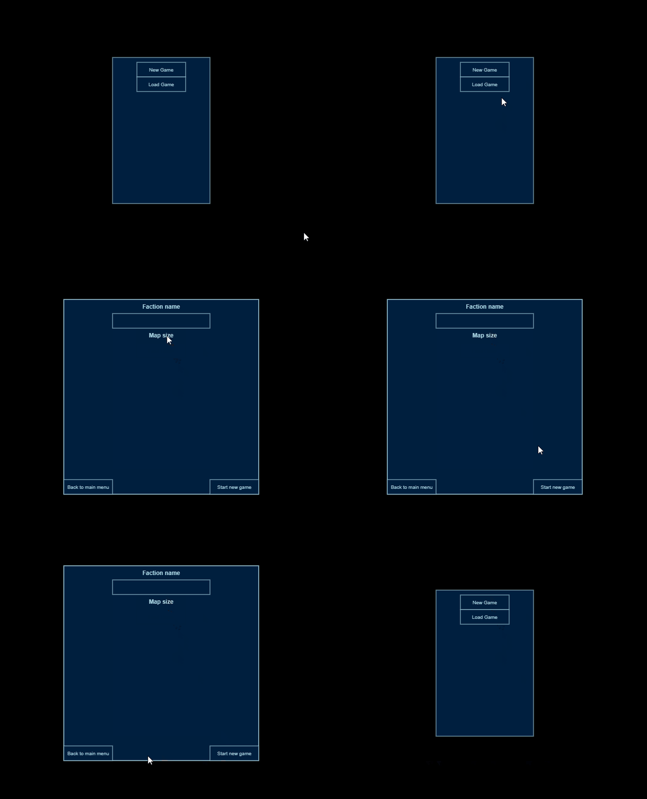
HoverableUIObject in action
Take a look a demo below to see how current implementation of HoverableUIObject work:
 As for now it seems, that Warp handles mouse event quite well. In the next steps, I’m planning to properly handle keyboard input, so it’s possible to use capabilities of
 TextInput component.
